
Kỳ thi IELTS là một trong những kỳ thi đánh giá năng lực tiếng Anh phổ biến nhất trên thế giới, đặc biệt quan trọng với những ai có kế hoạch du học hoặc định cư tại các quốc gia nói tiếng Anh. Trong đó, kỹ năng Writing Task 1 là một phần không thể thiếu, yêu cầu thí sinh phải mô tả, giải thích hoặc phân tích các biểu đồ, bảng biểu hoặc quy trình.
Để giúp bạn chuẩn bị tốt nhất cho phần thi này, chúng tôi sẽ giới thiệu các mẫu bài viết IELTS Writing Task 1 “đỉnh của chóp” để bạn tham khảo và học hỏi. Các mẫu bài viết này không chỉ giúp bạn nắm bắt cách viết một bài hoàn chỉnh mà còn cung cấp những chiến lược và mẹo làm bài hiệu quả.
Tại Sao Cần Tham Khảo Mẫu Bài Viết IELTS Writing Task 1?
Tham khảo các mẫu bài viết IELTS Writing Task 1 giúp bạn:
- Hiểu rõ cấu trúc bài viết: Nắm bắt cấu trúc của một bài viết Task 1 hoàn chỉnh.
- Nắm bắt từ vựng và ngữ pháp: Học cách sử dụng từ vựng và ngữ pháp chính xác và phù hợp.
- Cải thiện kỹ năng phân tích: Hiểu cách phân tích và diễn đạt thông tin từ biểu đồ, bảng biểu hoặc quy trình.
- Tăng cường tự tin: Tự tin hơn khi làm bài thi nhờ việc nắm rõ các yêu cầu và tiêu chí chấm điểm.
Trong IELTS Writing Task 1, các thí sinh thường gặp phải nhiều dạng biểu đồ và bảng biểu khác nhau. Dưới đây là top 10 chủ đề thường xuất hiện nhất trong phần này:
TOP 10 chủ đề thường xuất hiện nhất trong IELTS WRITING TASK 1
1. Biểu Đồ Đường (Line Graphs)
Biểu đồ đường thường được sử dụng để mô tả xu hướng theo thời gian. Thí sinh cần phải mô tả các xu hướng tăng, giảm, và sự ổn định trong một khoảng thời gian nhất định.
Đề Bài
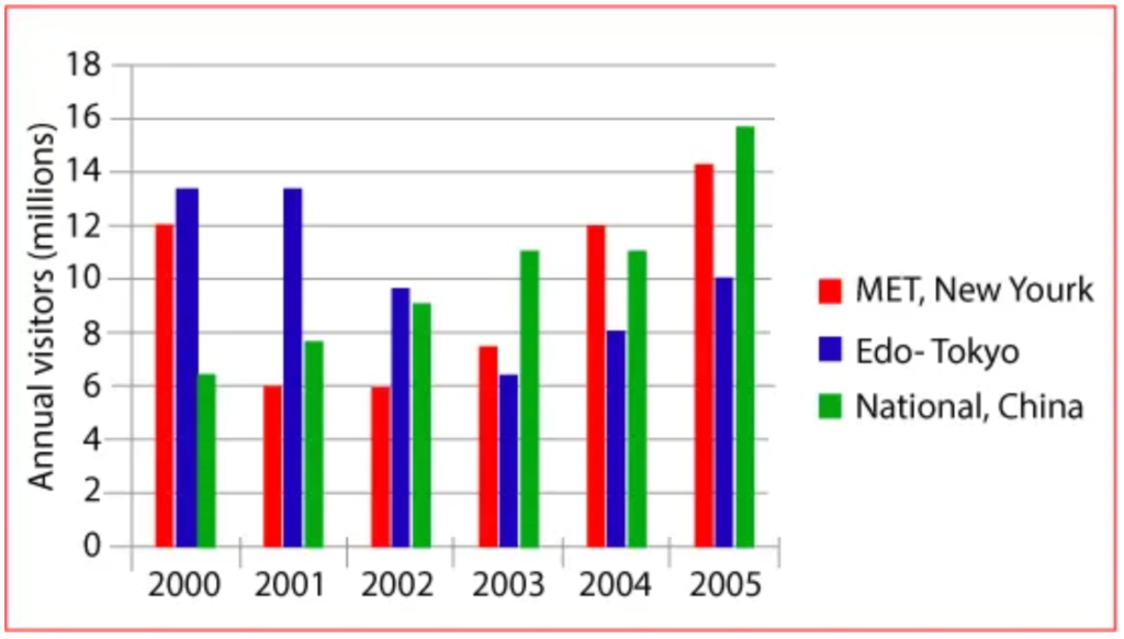
“The graph below shows the number of visitors to three different museums from 2000 to 2005.”
Cách Mô Tả
Mô tả xu hướng tăng, giảm của số lượng khách thăm bảo tàng trong giai đoạn từ năm 2000 đến 2005. Chú ý đến các điểm nổi bật như sự tăng đột ngột hoặc giảm mạnh.
(Nguồn: Writing9)
Bài viết mẫu band 4.5+
The bar chart highlights data about the number of visitors who visited the three museums over a five-year period between 2000 and 2005.
Overall, what stands out from the graph is that there was a remarkably upward Trend in the earnings of both MET which was located in New York and the National Museum of China while the compensation of Edo-Tokyo saw a considerable decline over the period in question. Another interesting point is that Edo-Tokyo was the most popular institution in the beginning , but in the end, the National Museum which was located in China was visited by a huge rate of voyagers than the others.
Looking at the details, as regards American museums, earnings started at 12 million visitors in 2000, then there was a fluctuation over the next 2 years, at which point it leveled off at 6 million until 2002. Earnings dipped slightly and recovered. Then the figure went up considerably, finishing at around 14 million in 2005. If we look at the Edo-Tokyo building, it has remained stable at approximately 13 million in the first two-year period, and decreased slightly, reaching 10 million in 2005.
By contrast, the revenue of the National Museum went in the opposite direction. Earnings of the National Museum increased steadily year on year .The interest started from 6 million voyagers in 2000 and hit a peak at approximately 15 million in 2005.
2. Biểu Đồ Cột (Bar Charts)
Biểu đồ cột được sử dụng để so sánh các số liệu giữa các nhóm khác nhau. Đây có thể là dữ liệu theo năm, theo quốc gia, hoặc theo các nhóm tuổi khác nhau.
Đề Bài
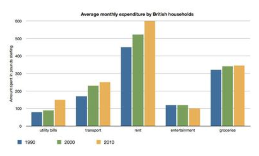
“The chart shows the average monthly expenditure by British households in three years.”
Cách Mô Tả
So sánh chi tiêu trung bình hàng tháng của các gia đình ở ba quốc gia khác nhau trong 3 năm 1990, 2000 và 2010, nhấn mạnh các sự khác biệt chính và các yếu tố tương đồng.
(Nguồn: Shiny Star)
Bài viết mẫu Bar Chart – Average Monthly Expenditure
The bar chart illustrates the average monthly expenses of a UK household for utility bills, transport, rent, entertainment and groceries, in three years (1990, 2000 and 2010). All the money spent is in pounds sterling.
Overall the maximum money spent was in the year 2010 and then in 2000. The largest expenditure was on rent in all the years, followed by groceries. Whereas a minimum amount of money was spent on entertainment as well as on utility bills. The maximum notable differences in expenditure was observed for commodities such as rent, transport and utility bills.
Rent being the most expensive commodity touched the peak of 600 in 2010, with slightly more than 500 and considerably less than 500 in the following years (2000 and 1990 respectively). UK citizens spent more than 300 and around 100 pounds on groceries and entertainment respectively every given year.
On the other hand, Money spent for transport in 1990 was under 200, which is around 250 in the later years. The expenditure of utility bills in 2010 accounts for around 250 in comparison to below 100 in the earlier years.
3. Biểu Đồ Tròn (Pie Charts)
Biểu đồ tròn thể hiện tỷ lệ phần trăm của các phần trong tổng thể. Thí sinh cần phải mô tả các phần lớn, phần nhỏ, và sự khác biệt giữa các phần.
Đề Bài
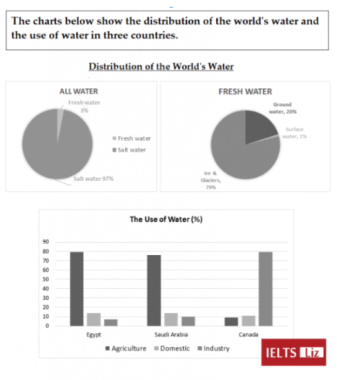
“The charts below show the distribution of the world’s water and the use of water in three countries.”
Cách Mô Tả
Mô tả tỷ lệ phần trăm của các nguồn tài nguyên nước trên toàn thế giới, nhấn mạnh vào các phần lớn nhất và nhỏ nhất.
(Nguồn: Engnovate)
Bài viết mẫu band 6.0+
The pie charts depict both all water and freshwater resources around the world, while the bar chart illustrates the usage area of water in Egypt, Saudi Arabia and Canada.
Salt water constitutes most of the world’s water. World’s scarce freshwater resources consist of three different sources: ice and glaciers, accounting for the majority of all freshwater. The consumption areas of water resources differ between the three countries. Egypt and Saudi Arabia use their water similarly for agriculture, while Canada allocates mostly to industrial purposes.
Salt water accounts for 97% of all water resources on Earth. The percentage of freshwater is only 3%, with ice glaciers and groundwater being the primary contributors at 79% and 20%, respectively. On the other hand, only 1 % of all freshwater consists of surface water.
The utilization of water occurs variously among countries. Egypt and Saudi Arabia use their water for agricultural purposes at nearly 80%, whereas fresh water of Canada is consumed mainly in industry, emerging almost 80%. The percentage of water, which is allocated for domestic use, realizes almost the same level in three countries at 10%, Canada legging behind slightly the others.
4. Bảng Biểu (Tables)
Bảng biểu cung cấp dữ liệu chi tiết dưới dạng số. Thí sinh cần phải mô tả và so sánh các số liệu trong bảng, chỉ ra những điểm nổi bật và sự thay đổi.
Đề Bài
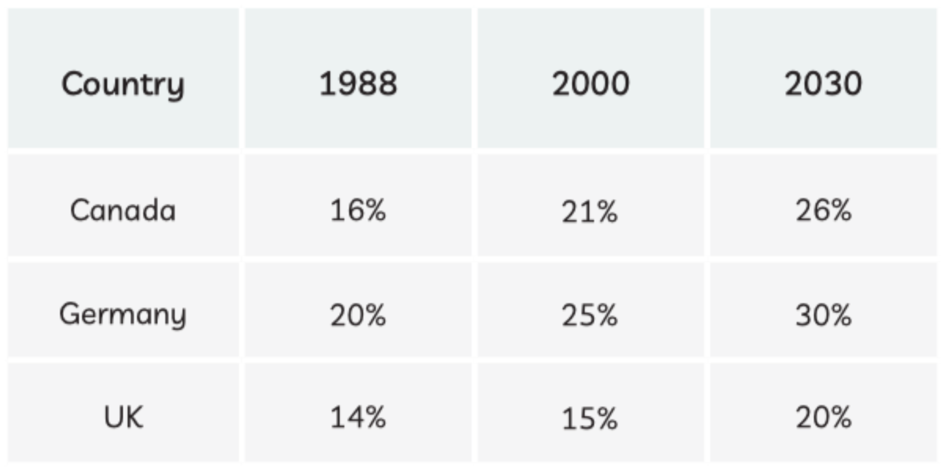
“The table below shows information and predictions regarding the change in percentage of population aged 65 and above in three countries.”
Cách Mô Tả
So sánh số liệu dân số của các quốc gia khác nhau trong năm 1998 và 2020 và dự báo cho năm 2030, nhấn mạnh các thay đổi đáng kể.
(Nguồn: IELTS practice online)
Bài mẫu tham khảo
The table shows the percentages of the Canadian, German, and British populations aged 65-and over in 1988, 2000, and predicted figures for 2030.
Overall, Germany had the highest percentages of the population aged 65 and over for all years, including predicted future figures, while the UK had the lowest figures in all years. Additionally, the figures for all countries increased over time, and are expected to continue increasing into the future.
In 1988, 20% of the German population were aged 65 and over. The figures for Canada and the UK were lower, at 16% and 14% respectively. By 2000, the percentage of the population aged 65 and over had risen in all countries, with Germany at 25%, Canada at 20%, and the UK at 15%.
Figures for all countries are expected to continue increasing into the future, and by 2030, 30% of the German population is predicted to be aged 65 or over. The figures for Canada are predicted to be 26%, while the UK will be at 20%.
5. Biểu Đồ Kết Hợp (Mixed Charts)
Biểu đồ kết hợp có thể bao gồm hai hoặc nhiều loại biểu đồ khác nhau, chẳng hạn như biểu đồ cột kết hợp với biểu đồ đường. Thí sinh cần mô tả cả hai loại dữ liệu và cách chúng liên quan với nhau.
Đề Bài
“The table and pie chart gives information about the population in Australia according to different nationalities and areas.”
Cách Mô Tả
Mô tả cả biểu đồ tròn và bảng biểu về cung cấp thông tin về dân số ở Úc theo các quốc tịch và khu vực khác nhau, nêu rõ mối liên hệ giữa hai loại dữ liệu này.
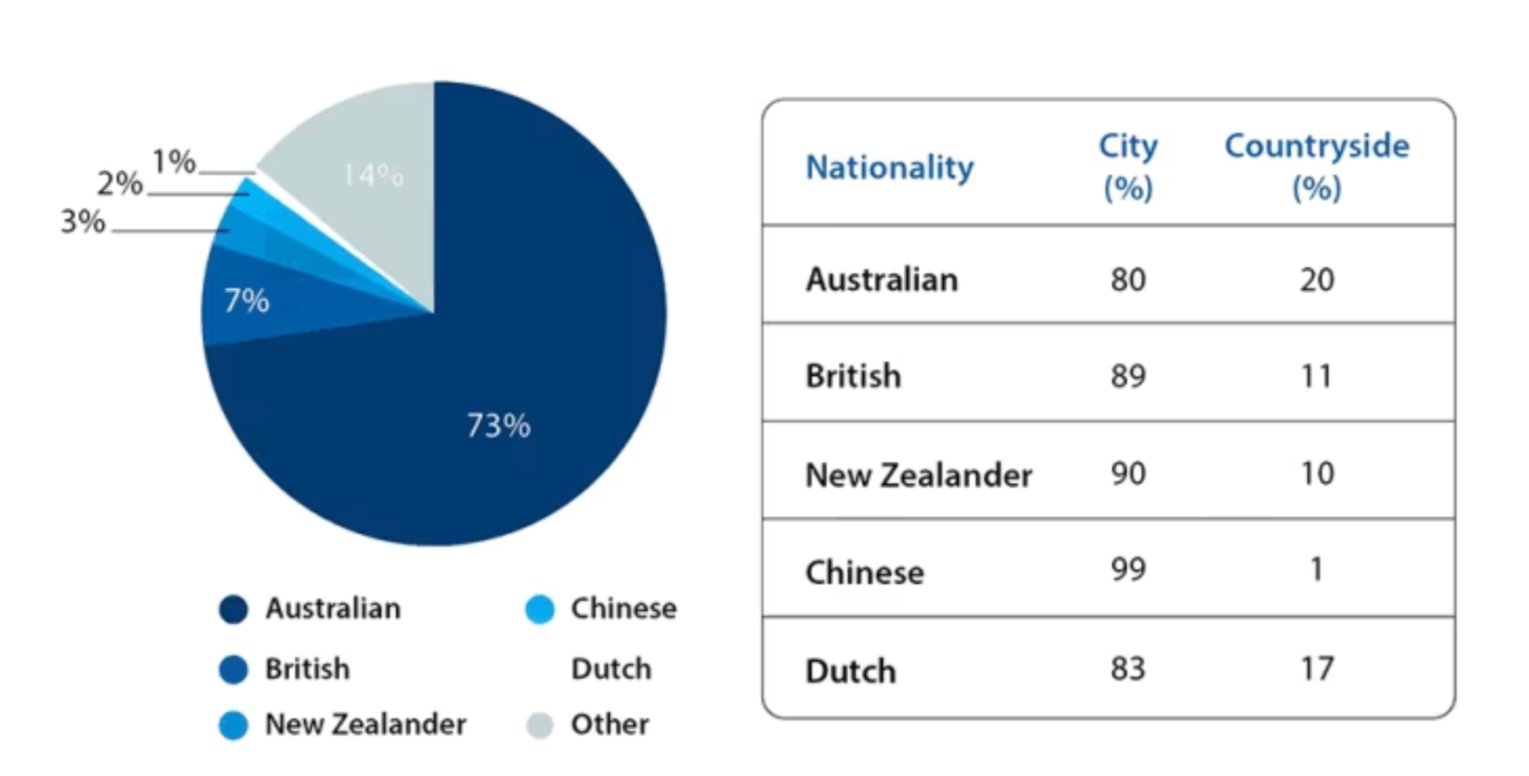
(Nguồn: idp IELTS)
Bài mẫu tham khảo
The given pie chart illustrates the percentages of different nationalities that make up the Australian population, while the table gives information about whether they live in urban or rural areas.
In general, it is evident that the vast majority of Australia’s population is of Australian nationality. Furthermore, most people in this country, irrespective of their nationality, opt to live in cities.
The percentage of the Australian population that are of Australian nationality is 73%, whereas the figures for people of British or other nationalities are significantly lower, at 7% and 14% respectively. Meanwhile, 3% of the population come from New Zealand, while 2% are of Chinese nationality. 1% of Australia’s population comes from the Netherlands.
From the table it can be seen that 80% of Australians choose to reside in cities, along with 89% of the British and 90% of the New Zealanders. Similarly, 99% of Chinese live in the city, as do 83% of the Dutch.